Thu Aug 04, 2011 7:54 pm
#48606
After a little testing, this is my review of the 2011 Michaels pumpkin, in comparison to previous versions.
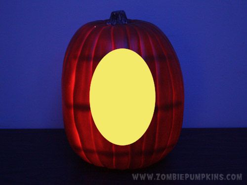
Here's the 2011 version of the artificial pumpkins available at Michaels. It's about a foot tall and about 33" around. It has a fairly flat face, meant to be the carving area. Maybe slightly tapered at the top, but mostly negligible.

I'm not sure if there were many design variations prior to 2010 when we started to see more bold changes. Size-wise, they all seem to be pretty comparable. Here are the 3 variations I currently have:

Note that the color is a darker orange than before. Looks very vivid in the above photo due to camera flash, but I think it's better than previous paint choices. Especially in natural light, it appears more "pumpkin orange" and less yellow. I like it.
Also, the stem is pretty thick, with an edge that looks cut, and it's brown, rather than green. Like you might expect to see with a pumpkin that's been harvested a while go. While I'd love to see a whimsical curling stem like my illustrated pumpkins have, I understand that they'd be more like to break off in transit. I have the same issue with real pumpkins, the cool long stems often get broken off, sadly. Anyway, here, let's compare the stems:


Another factor is how smoothly they can be cut. For the purposes of Zombie Pumpkins cut-through patterns, I mostly use a Versa Tool heated knife. Michaels also keeps PM Artificial Pumpkin Carving Tools nearby, which are basically like the usual PM carving kits, but the blades are a little pointier and have more teeth.
I cut small holes into the bottom of my pumpkins for a test. Below is the 2009 pumpkin. The saw tool results in "crumbly" edges, but that's typical. The Versa Tool hot knife made for smoother lines with no paint peel issue.

Directly below is the same test on a 2010 pumpkin. The pumpkins from this year appear to have a thicker shell. The crumbly saw cut hole was hard to clear out here. Also, the paint tends to peel back, like dried liquid latex. Their foam carving Easter eggs from 2010 had these same issues (too thick, peeling paint):

And the next photo is the same test on the new 2011 pumpkin. As with any of these pumpkins, the paint can bubble up if you leave the heated blade in one spot too long, but overall you'll notice clean lines with both tool types here. The paint stayed put and did not peel for me. Also, the shell of the pumpkin seemed thinner, which makes a cut-out pattern even easier:

To compare pumpkin shell thickness, let's compare the 2011 pumpkin to the previous 2010 version. Notice my 2011 pumpkin is quite a bit thinner:

The thickness of the pumpkin seems relative to how many support bands they place inside. These are the bane of existence for many carvers, especially those who do "shaded" designs.
Here's the inside of a 2009 pumpkin. One fat band all around the equator. Many of us have sanded this down so the amount of light glowing from inside would be consistent all over the surface:

My 2010 pumpkins have no support band inside, it's smooth as can be. But to give the pumpkin strength, my 2010 pumpkins seem thicker overall. Some might like this, but for doing a cut-out design with the short blade of the Versa Tool, this is possibly too thick:

And then we have the inside of the 2011 pumpkin below. They seem to have thinned out the shell, and added a ribcage of support bands. Smaller than the fat line of the 2009 'kins. Smaller, but more of them:

Looking at these bands inside, I'm honestly not sure if they help THAT much. I'm not too worried about crushing my pumpkins (they are somewhat flexible, which actually helps them not get crushed). I'd prefer to not have these bands, because they can show up when lit:

Don't let these images of the cross-bar shadows intimidate you though. Their appearance is dependent on how bright your inside light is, and (in terms of photos) how long your shutter is open. Here's another photo with a longer exposure time, which of course makes it look worse:

If these lines bother you, they can be sanded down. Although, for a cut-through ZP design, I don't think they will have too much of a negative effect. Sure, the shadow lines look bad when you're looking at a blank pumpkin, but once a the face is carved and pure light is pouring out, you may not even notice the "ribcage" shadows.
So here's my personal opinion:
- Deeper orange color = GOOD
- Non-peeling paint = GOOD
- Thinner shell = GOOD (appropriate for cut-out designs)
- Closed bottom = GOOD (good practice area, also you can cut a hole to exactly fit your lighting source of choice)
- Stumpy stem = FINE (but longer would look cool)
- Size/shape = FINE (although an alternate "wide" version would be nice)
- Support bands inside = POOR (seems unnecessary, in the way of carving, visually distracting when lit)
Overall, I'm pleasantly surprised and think they have made some crucial improvements over the 2010 model (the paint type). While some aspects would fall on my wishlist of "nice to have," I'm willing to take what we can get, in most areas. I'd say that the thick lines inside are the main annoyance to address.
Also, we may have differing reports on the thickness. My 2011 pumpkin seem thinner. And the desired thickness may be a slight point of debate for those who "shade" and those who "cut out." More range for depth levels helps the shader, but as a maker of cut-out designs, I think a thinner shell works easier.
And that's my 2 cents. I can't believe I spent the whole afternoon gathering this "data." Actually, yes I can.
Here's the 2011 version of the artificial pumpkins available at Michaels. It's about a foot tall and about 33" around. It has a fairly flat face, meant to be the carving area. Maybe slightly tapered at the top, but mostly negligible.
I'm not sure if there were many design variations prior to 2010 when we started to see more bold changes. Size-wise, they all seem to be pretty comparable. Here are the 3 variations I currently have:
Note that the color is a darker orange than before. Looks very vivid in the above photo due to camera flash, but I think it's better than previous paint choices. Especially in natural light, it appears more "pumpkin orange" and less yellow. I like it.
Also, the stem is pretty thick, with an edge that looks cut, and it's brown, rather than green. Like you might expect to see with a pumpkin that's been harvested a while go. While I'd love to see a whimsical curling stem like my illustrated pumpkins have, I understand that they'd be more like to break off in transit. I have the same issue with real pumpkins, the cool long stems often get broken off, sadly. Anyway, here, let's compare the stems:
Another factor is how smoothly they can be cut. For the purposes of Zombie Pumpkins cut-through patterns, I mostly use a Versa Tool heated knife. Michaels also keeps PM Artificial Pumpkin Carving Tools nearby, which are basically like the usual PM carving kits, but the blades are a little pointier and have more teeth.
I cut small holes into the bottom of my pumpkins for a test. Below is the 2009 pumpkin. The saw tool results in "crumbly" edges, but that's typical. The Versa Tool hot knife made for smoother lines with no paint peel issue.
Directly below is the same test on a 2010 pumpkin. The pumpkins from this year appear to have a thicker shell. The crumbly saw cut hole was hard to clear out here. Also, the paint tends to peel back, like dried liquid latex. Their foam carving Easter eggs from 2010 had these same issues (too thick, peeling paint):
And the next photo is the same test on the new 2011 pumpkin. As with any of these pumpkins, the paint can bubble up if you leave the heated blade in one spot too long, but overall you'll notice clean lines with both tool types here. The paint stayed put and did not peel for me. Also, the shell of the pumpkin seemed thinner, which makes a cut-out pattern even easier:
To compare pumpkin shell thickness, let's compare the 2011 pumpkin to the previous 2010 version. Notice my 2011 pumpkin is quite a bit thinner:
The thickness of the pumpkin seems relative to how many support bands they place inside. These are the bane of existence for many carvers, especially those who do "shaded" designs.
Here's the inside of a 2009 pumpkin. One fat band all around the equator. Many of us have sanded this down so the amount of light glowing from inside would be consistent all over the surface:
My 2010 pumpkins have no support band inside, it's smooth as can be. But to give the pumpkin strength, my 2010 pumpkins seem thicker overall. Some might like this, but for doing a cut-out design with the short blade of the Versa Tool, this is possibly too thick:
And then we have the inside of the 2011 pumpkin below. They seem to have thinned out the shell, and added a ribcage of support bands. Smaller than the fat line of the 2009 'kins. Smaller, but more of them:
Looking at these bands inside, I'm honestly not sure if they help THAT much. I'm not too worried about crushing my pumpkins (they are somewhat flexible, which actually helps them not get crushed). I'd prefer to not have these bands, because they can show up when lit:
Don't let these images of the cross-bar shadows intimidate you though. Their appearance is dependent on how bright your inside light is, and (in terms of photos) how long your shutter is open. Here's another photo with a longer exposure time, which of course makes it look worse:
If these lines bother you, they can be sanded down. Although, for a cut-through ZP design, I don't think they will have too much of a negative effect. Sure, the shadow lines look bad when you're looking at a blank pumpkin, but once a the face is carved and pure light is pouring out, you may not even notice the "ribcage" shadows.
So here's my personal opinion:
- Deeper orange color = GOOD
- Non-peeling paint = GOOD
- Thinner shell = GOOD (appropriate for cut-out designs)
- Closed bottom = GOOD (good practice area, also you can cut a hole to exactly fit your lighting source of choice)
- Stumpy stem = FINE (but longer would look cool)
- Size/shape = FINE (although an alternate "wide" version would be nice)
- Support bands inside = POOR (seems unnecessary, in the way of carving, visually distracting when lit)
Overall, I'm pleasantly surprised and think they have made some crucial improvements over the 2010 model (the paint type). While some aspects would fall on my wishlist of "nice to have," I'm willing to take what we can get, in most areas. I'd say that the thick lines inside are the main annoyance to address.
Also, we may have differing reports on the thickness. My 2011 pumpkin seem thinner. And the desired thickness may be a slight point of debate for those who "shade" and those who "cut out." More range for depth levels helps the shader, but as a maker of cut-out designs, I think a thinner shell works easier.
And that's my 2 cents. I can't believe I spent the whole afternoon gathering this "data." Actually, yes I can.